Two people and a screen
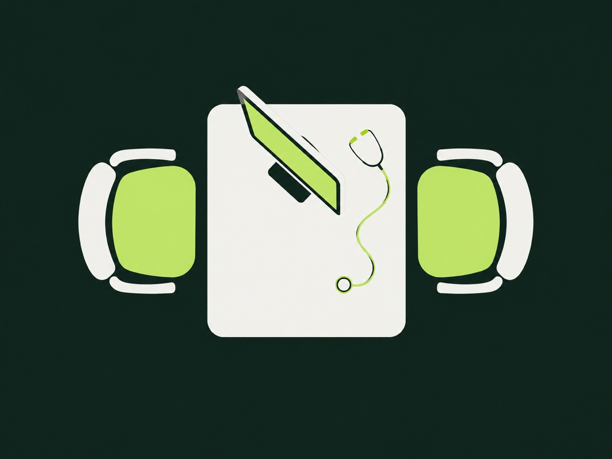
A consultation room has three participants: the clinician, the patient and the computer. In many hospitals, the computer wins the attention contest. The doctor types while the patient talks, eyes drift to the monitor, and the person describing their worry ends up addressing the side of a head.
This is not a failing of doctors. It is a design problem, and it is one that people who build hospital software can do something about.
Start with the ten minutes, not the data model
Hospital systems are usually designed around records: what must be captured, billed, reported. That is necessary. But the consultation is a short, pressured conversation, and the interface either supports it or competes with it.
Picture a clinic with a queue in the corridor and a ten minute slot per patient. In that time the clinician has to review history, listen, examine, decide, explain, prescribe and document. Every extra click or screen load comes out of the part that actually matters. A form that demands fifteen mandatory fields before a note can be saved teaches clinicians to fill them with whatever gets them through.
So we start by watching the consultation itself, or hearing it described, and ask what the clinician needs at each moment. Before: a clear summary of the last visit, current medications, allergies and recent results. During: fast entry that does not break eye contact. After: orders and a note that reflect what was decided, with little retyping.
Principles that hold up
- Show what matters first. Allergies and active medications should not sit three tabs deep. Safety information belongs where it cannot be missed.
- Capture once. If a vital sign was recorded at triage, the doctor should see it, not re enter it. Duplicate entry is the classic source of both frustration and error.
- Make common things quick. The most frequent diagnoses, prescriptions and orders should take a couple of taps. Rare cases can be slower.
- Allow structure without forcing it. Free text is how clinicians think. Structured fields are how reports and billing work. Good design lets people write naturally and still produces usable data, rather than demanding one at the expense of the other.
- Fail gracefully. Power cuts and weak connectivity are normal in many facilities. A screen that freezes mid consultation is worse than none. Offline friendly design, with saved drafts and sync when the connection returns, is not a luxury in our markets.
Think about a follow up visit. The clinician opens the record and needs three things within seconds: what was decided last time, what has changed since, and what is outstanding. If the answer sits in a scrolling wall of notes, the clinician skims, and skimming is where details are lost. A short, structured summary at the top, drawn from the earlier note, does more for safety than another alert.
The same goes for orders. Requesting a test or writing a prescription should feel like part of the conversation, not a separate administrative task done afterwards. When it happens in the room, with the patient watching, mistakes are more likely to be caught on the spot.
The patient is a user too
The patient rarely sees the interface, but they feel it. Screen sharing, where the clinician turns the monitor so the patient can see a result or a medication list, builds understanding. Clear printed or messaged instructions after the visit help the patient follow a plan. A system that speaks only to billing departments leaves the patient with nothing.
Language and literacy matter here as well. Instructions in plain wording, and where relevant in the languages patients actually speak, reduce confusion.
Be careful with clever features
Prompts and alerts can help, but too many of them train people to click through. Alert fatigue is well documented in clinical settings: when every screen warns about something, warnings stop being read. We would rather show fewer, better targeted prompts than a constant stream, and test them with the people who will see them.
Any feature touching clinical decisions should be reviewed by clinicians and governed by the hospital's own protocols. Software should support judgement, not quietly replace it.
How to find out if it works
Sit in. Time a consultation with the old process and the new. Ask clinicians what they stopped doing and what they started working around, because workarounds are the most honest feedback a system gets. Revisit the design after a month of real use, when habits have formed.
The best measure of a consultation room system is how little of the consultation it takes.